Go back

Dialing into User Experience

Dialing into User Experience

Elevating AI-Driven Calling with Design Consistency

Introduction

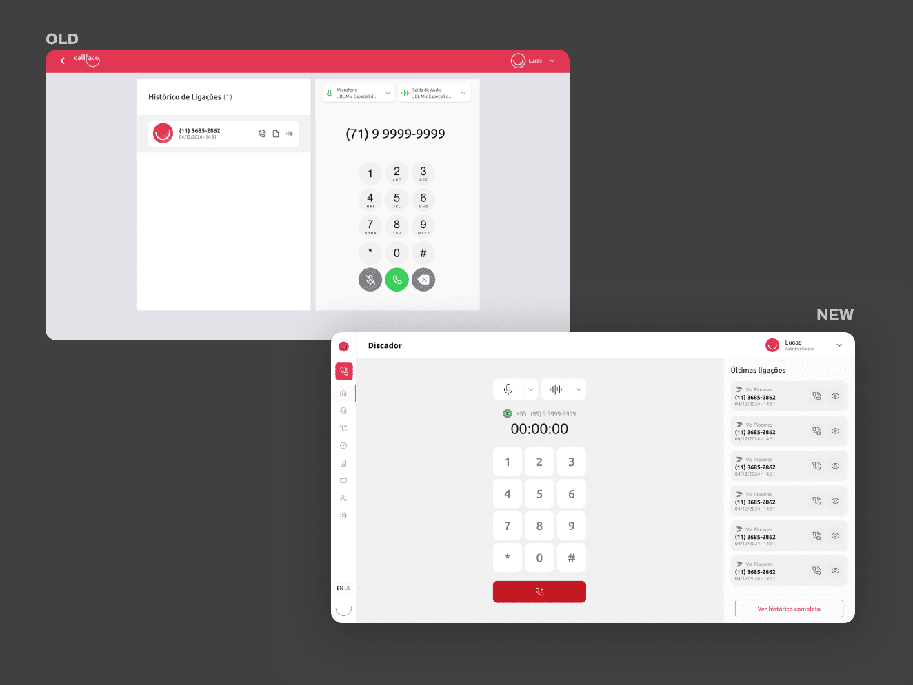
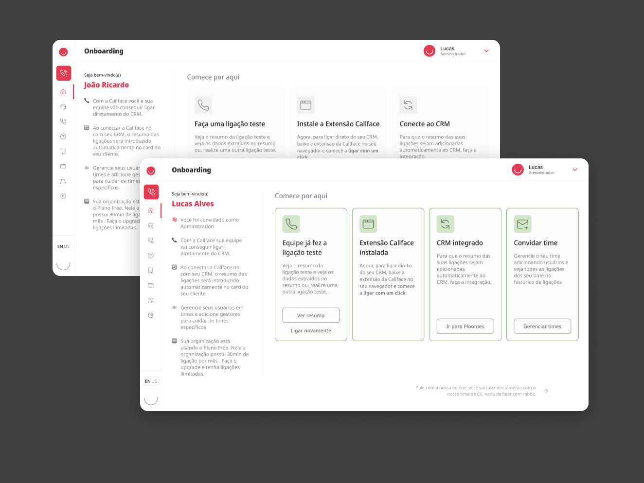
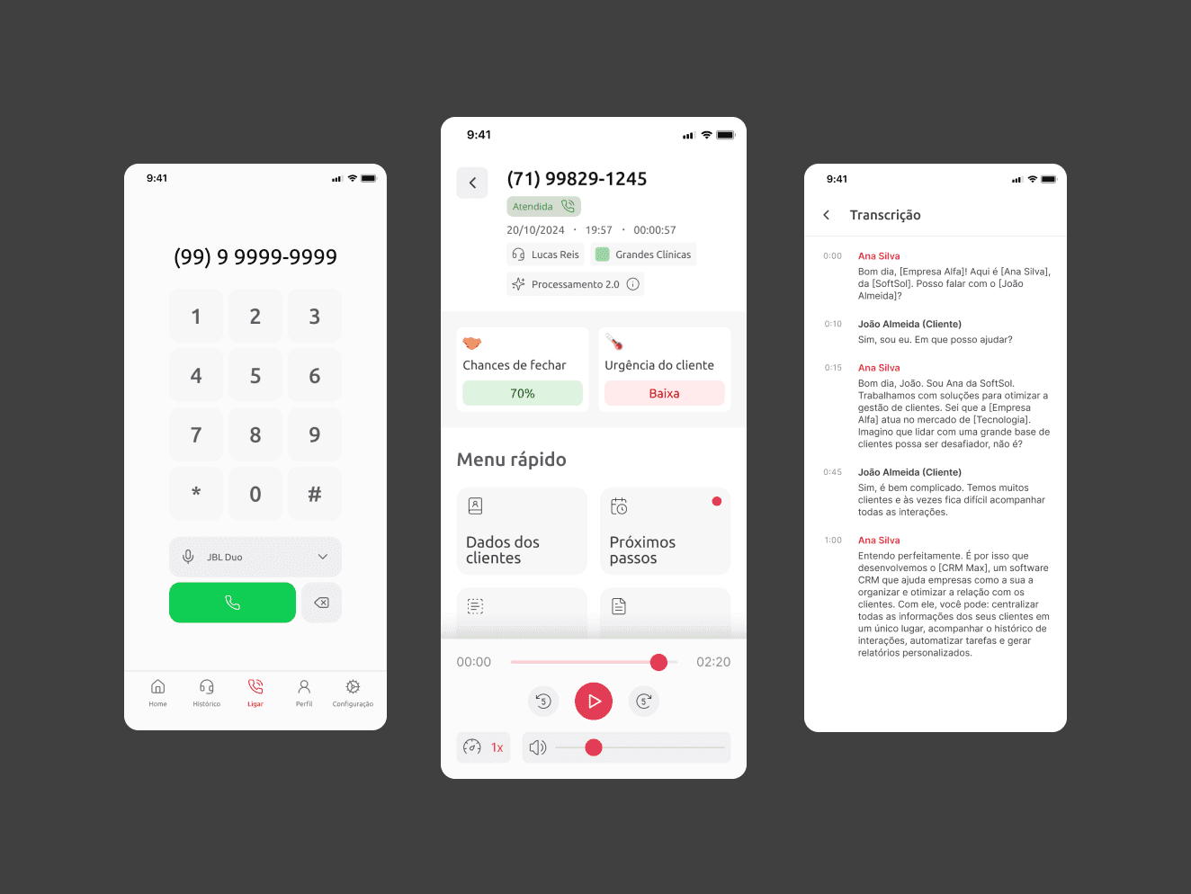
At Callface, an AI startup focused on sales calls, I was brought in as Designer & Product Manager to improve onboarding and unify the product’s design. The platform connects companies with leads, transcribes calls using AI, and automates CRM updates — but fast growth had exposed usability and consistency issues.

My Contributions

I redesigned the onboarding flow to suit different user profiles, ran a UX audit to identify key pain points, and rebuilt the design system for consistency. Working closely with engineers, I helped deliver a smoother setup experience and clearer UI, resulting in faster onboarding and higher engagement.

Challenge

Growth was slower than expected, largely because onboarding required too much manual guidance. New users struggled to get started on their own, while existing users found it difficult to add teammates or scale their operations. On top of that, inconsistent visuals and interactions across the interface created additional friction during adoption.

Discovery & Research

I began with a UX audit, identifying key friction points in the existing flow. I also ran support data analysis and internal interviews with Customer Success to map out the most common pain points.


Key insights included:

  • Users didn’t understand the technical setup (e.g., connecting a CRM).

  • First-time value wasn’t clear — it took too long to reach the “aha moment.”

  • Language and layout were inconsistent between onboarding, dashboard, and usage screens.


Design Process

I redesigned the onboarding flow to adapt to different user types — whether they were new to cold calling or integrating with an existing CRM. I created a progressive disclosure model that guides users through setup one step at a time, celebrating small wins along the way.


In parallel, I restructured the design system. Typography, button styles, components, and empty states were made consistent. I worked closely with the engineering team to update the component library and ensure alignment across screens.

Conclusion

While we’ve already seen strong results from the onboarding redesign and design system improvements, my work on the platform is ongoing. As Product & Design Manager, I continue to evaluate user behavior, gather feedback, and iterate on the experience to support the platform’s growth and ensure it scales with clarity and consistency.

Challenge

Maquineta Virtual, a startup catering to service-based businesses, faced several challenges with its existing platform. Users encountered issues with the outdated design, lack of split payment functionality, and poor mobile responsiveness. Additionally, businesses were deterred by the high fees associated with existing market solutions for credit card payments.

Solution

As the UX designer for Maquineta Virtual, I undertook the task of redesigning the platform and implementing new functionalities, with a specific focus on introducing split payments. The goal was to enhance user experience, foster collaboration between businesses, and drive growth in the service-businesses sector.

Objectives

  • Improve the user-friendliness of the platform through a comprehensive redesign.

  • Integrate split payment functionality to enable seamless profit sharing between collaborating businesses.

  • Develop a scalable solution to support Maquineta Virtual's future growth.

User Research

  • Conducted market research, which revealed a significant number of users engaging in collaborative partnerships.

  • Created user personas to better understand the target audience, including solopreneurs and businesses tracking agreements with contracts.

  • Engaged in regular user feedback sessions and interviews during the redesign and implementation phases.

Design Process

  • Mapped the existing platform to identify pain points and areas for improvement.

  • Wireframed the redesigned platform, considering user flows and service blueprints to enhance collaboration between businesses.

  • Employed low-fidelity designs for initial user testing, incorporating iterative feedback loops.

  • Focused on simplifying split payment processes and improving UX writing for clarity.

Design Principles

  • Leveraged UX Laws of Common Region and Similarity to create intuitive and cohesive user experiences.

  • Prioritized a clean and modern design aesthetic to improve visual appeal and user engagement.

  • Emphasized responsive design to optimize the platform's performance on mobile devices.

Conclusion

Through the redesign and implementation of split payments, Maquineta Virtual will successfully addressed user pain points and positioned itself in the market providing cost-effective credit card solutions for service-based businesses. The collaboration-focused platform design, coupled with the scalable foundation, enables Maquineta Virtual to meet the evolving needs of its users while fostering business growth.

Let's talk!

Let's

talk!

Let's

talk!

Send a message